

From Browser Hacks to Modern CSS:
A Frontend Evolution
There was a time when websites would specify which browser they were best viewed with. Fortunately, that’s long gone, and the possibilities in frontend web development have truly improved enormously. Today, browsers still differ in their support for web standards and APIs, but achieving a uniform look and basic behavior requires hardly any effort anymore. A brief excursion into things I wouldn’t want to miss today.
The Foundation: Resets and Normalize
Many of the old browser problems started with the basic layout standards. The first step was usually to create a uniform foundation. Initially with hard resets, later with normalizations. Even today, I still rely on such a step, using modern-normalize—small, sensible, and completely sufficient.
The Box Model: An Intuitive Solution
A truly annoying topic was the box model. When do margin, border, and padding count towards the specified width, and
when do they not? Were there even finer nuances in case of doubt? And which browser followed which standard? A problem
that fortunately no longer matters at all. Today, a single line, * { box-sizing: border-box; }, in the reset is
usually enough, and everything behaves intuitively. Pixel-perfect layouts were always possible cross-browser, but today
it’s almost effortless.
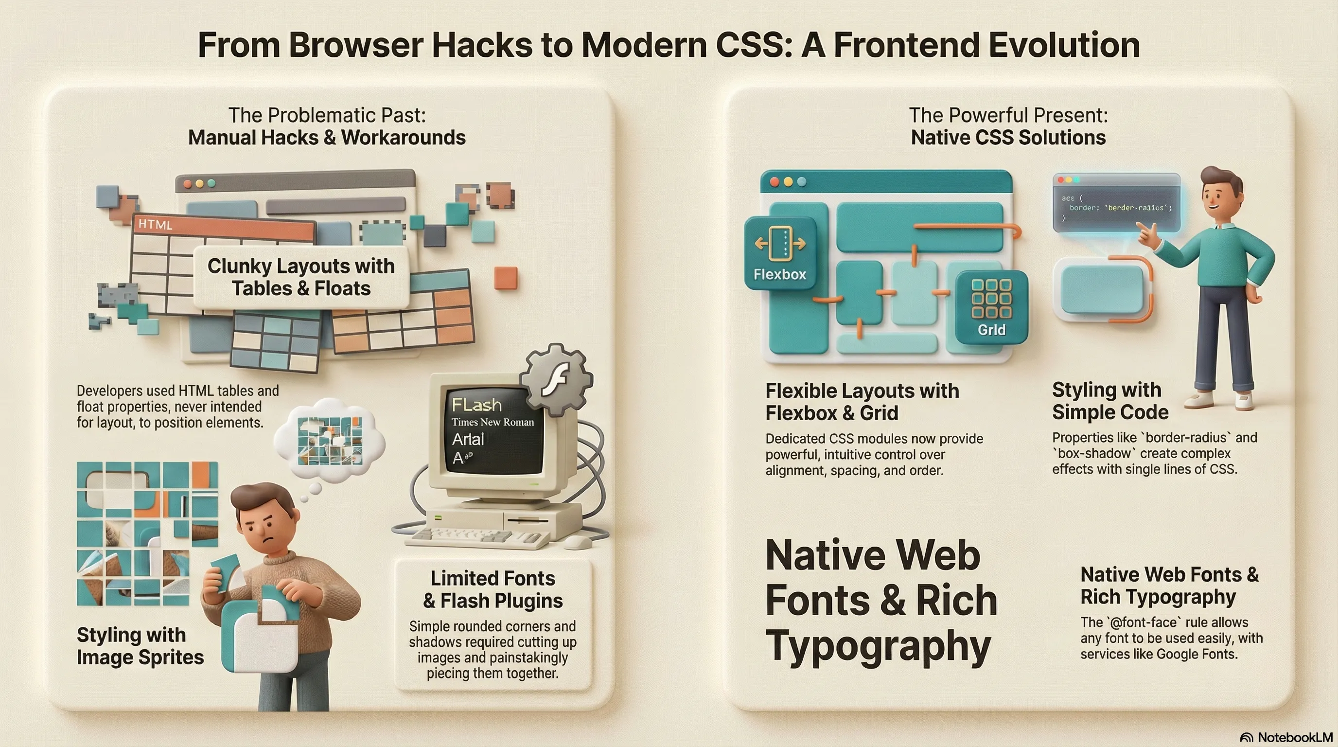
Rounded Corners: From Images to Native CSS
Rounded corners are everywhere again today—on my own site, on buttons, cards, form fields. In the past, we crafted images for this, painstakingly pieced them together, just so the actual form element could still fit somewhere. A semantic horror. And to load the many small images efficiently, they were often packed into sprites—a technique primarily known from 2D game development.
Shadows and Transparency: No More Hacks
Exactly the same applied to shadows. Additional problem: transparency. Especially for Internet Explorer, cumbersome
hacks were needed for a long time to display shadows with proper alpha channels. Today, a few simple CSS properties like
border-radius and box-shadow suffice—and both even work together perfectly, including soft, rounded shadows.
Web Fonts: From Images to Native @font-face
Who still knows the term “web-safe fonts” today? That was the tiny selection of fonts that were truly available
everywhere. For headings or distinctive text, you often wanted something of your own. In the past, this was solved with
images, later with sIFR (Flash-based) or Cufón (JavaScript with Canvas/VML). Today, it’s all native @font-face with
WOFF/WOFF2. Even for body text. Services like Google Fonts make it ridiculously easy, Variable Fonts save additional
loading time, and font-display: swap prevents annoying invisible blinking during loading.
Layout Evolution: From Hacks to Flexbox and Grid
The actual layouts in the past were characterized by iFrames, tables, or floats. iFrames for layout purposes have practically disappeared, tables can finally do what they were meant for again: presenting data. Floats still play a minor role, but all these hacks have been replaced by CSS Flexbox and later CSS Grid. Not only can elements be positioned and aligned magnificently with these, but completely different mobile and desktop variants can also be built from the same HTML.
Responsive Design: Mobile-First as Standard
Responsive designs were often strictly separate in the past—often via an “m.” subdomain. Today, mobile-first is good practice. You start small and adapt for larger viewports. CSS media queries together with modern units (rem, vw, vh, fr, clamp()) and, of course, Flexbox and the absolutely flexible Grid make it possible to conjure completely new layouts from one and the same markup.
Vendor Prefixes: Automated with Autoprefixer
During the transition phase, when browsers introduced new features, you constantly needed vendor prefixes (-webkit-, -moz-, -ms-). Only with tools like Autoprefixer and PostCSS did normal work become possible again: you write the standard property, and all browser-specific code is automatically added.
Animations: From Flash to Native CSS
Topics like animations and transitions were practically impossible in the past without JavaScript or Flash. Today, with native CSS transitions, @keyframes, and transforms, so much movement and interaction can be created that a modern web application is second to a native app in almost nothing.
The Future: Rapid Development
And the best part: development continues at a breakneck pace. Features like Container Queries, the :has() selector, or
View Transitions sometimes already feel like magic. I’m excited to see what the next few years will bring.
Further Reading & Resources
- MDN Web Docs – The go-to reference for HTML, CSS, and JavaScript. Always up-to-date and incredibly thorough.
- Can I use… – Essential for checking browser support for anything from
border-radiusandbox-shadowto Flexbox, Grid,@font-face, or newer stuff like:has(). - CSS-Tricks Almanac – Clear, example-rich explanations of pretty much every CSS property and selector.
- Modern CSS Solutions – Shows exactly what the article is about: solving old problems with clean, modern CSS techniques.
- Autoprefixer – Writes the standard property once, and it automatically adds all necessary vendor prefixes (integrated in PostCSS, Vite, etc.).
- PostCSS – The foundation for Autoprefixer and many other modern CSS tools – makes working with cutting-edge features painless.
- Google Fonts – Dead simple way to add web fonts, with built-in support for Variable Fonts and performance options.
- Flexbox Froggy – The most fun way to really understand Flexbox.
- Grid Garden – Same concept as Froggy, but for CSS Grid – great for experimenting with layouts.
- Layoutit Grid – Quick interactive CSS Grid generator with instant code export.